Logo Color Schemes
Logo Color Schemes
Analogous
This photo uses the analogous colors of dark brown, brown, and a lighter tan. I think the company chose these colors because it shows the colors of the drink and it gives the consumer a better idea of what the product is.

This photo uses the analogous colors of dark green, green, and yellow. I think the company chose these colors because greens and yellows are typically used to symbolize nature, and they wanted to portray that their company is nature friendly, or more of a natural gas station compared to others.


 This photo uses the warm color of red. I think the main reason the company used the color red was to show that the drink was welcoming to all families. I also feel like it can show how they are a overall loving business.


 This photo uses monochromatic shades and tints of the color green. I think the reason the company chose these colors is to show that they are a relaxing and almost natural hotel that you can go to when you just need some peace and quiet.


This photo uses the triad colors of red, blue, and yellow. I think the company used these colors because the yellow and red can almost look like a hamburger, and the blue swoosh could probably symbolize that it is a fast food restaurant.
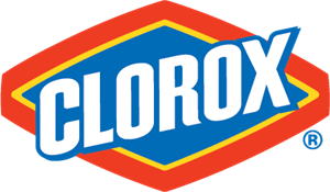
This photo uses the triad color schemes of red, blue, and yellow. I think the company used these colors for many reasons. The red can symbolize that they are a family company and are caring, the blue can show how you can trust their products to work and clean, and the yellow could mean happiness or freshness in the outcome of using their product.
This photo uses the analogous colors of dark green, green, and yellow. I think the company chose these colors because greens and yellows are typically used to symbolize nature, and they wanted to portray that their company is nature friendly, or more of a natural gas station compared to others.
Complementary
This photo uses the complementary colors of orange and blue. I think the company chose these colors because, in a more obvious way, the foxes fur coats are orange, but i feel like they made the earth mainly blue to show that they are loyal, and that you can trust their browser

This photo uses the complementary colors of red and green. I think the company chose these colors because, they are the colors of a chile, which helps incorporates the name of the restaurant into the total design.
Warm Colors

This photo uses the warm colors of red and yellow. I think the company used these colors because, the red can possibly indicate the salsa that these chips can be dipped into. It could also portray the product as being more enjoyable.
Cool Colors
This photo uses the cool color of dark blue. I think the reason this company chose this color is because toothpaste is usually mint flavored, and this color can show that the product is refreshing and minty.
This photo uses the cool color of violet. I think the reason this company chose the color violet is because, knowing that violet symbolizes power, they probably wanted people to know that they have a very strong and powerful business.
Monochromatic Colors
Monochromatic Colors
This photo uses the monochromatic colors of the color blue. I think the reason the company chose to use these colors is because usually blue can symbolize trust, and they want you to know that you can trust their company with your money.
Triad Colors
This photo uses the triad colors of red, blue, and yellow. I think the company used these colors because the yellow and red can almost look like a hamburger, and the blue swoosh could probably symbolize that it is a fast food restaurant.
This photo uses the triad color schemes of red, blue, and yellow. I think the company used these colors for many reasons. The red can symbolize that they are a family company and are caring, the blue can show how you can trust their products to work and clean, and the yellow could mean happiness or freshness in the outcome of using their product.

Comments
Post a Comment