Posts

quarter 4 final project

Image
Our Project For our final project, the teachers gave us teams of four or five, and assigned us with the task of creating a product. This may sound easy now but trust me, it was pretty difficult and had many different components to the whole project. Not only did we have to brainstorm ideas to make the product, but after we decided on the idea of making a hair growing shampoo called Ulu Lae , we had to make sure that our product would sell. We created advertisements, animations, logos, graphic designs, commercials, and even a website so we could really show off our product to the buyers. After all of this was created, we then had to present our ideas in front of the e9 teachers and anyone else in their classes, sort of like an episode of shark tank. This project had to be very thought out, and took mainly the whole fourth quarter to create, with rotations from the e9 teachers classes around every two weeks. Many people saw the more put together side ...

personality types

Image
My Personality Type After answering all of the questions on the test, the website showed that my personality type was ENFJ. It said that I was 3% more of an extrovert, 19% more intuitive, 6% more on using my feelings rather than thinking, and 16% more of judging something. When I clicked on the next website to see what a ENFJ personality type was like, it said a lot about how they were very helpful to other people and how they were really loyal. It also stated that these people often are the leaders of the group and like to take control of what is going on around them. Another page that I went to even had one word at the top that seemed like an overall summary of that personality type, and my word was teacher. That page also talked about how these people are very optimistic and how they put others before themselves. Overall I feel like this personality type describes me really well, I would say that I am very helpful to other people and that I am very positive and optimistic. I ha...

ab sequence video

Image
AB Sequence Video For this this project, the main task was to make another video, but this video had different requirements then our first assignment. For this video, we had a one minute time limit, and it was all about the sequence of the video and getting from spot A to spot B. We also decided teams in a different way, instead of having two people in a group, we had four team members and each one had a different task. Personally I was the person that filmed the video, which I enjoyed doing. Overall, everyone got along in our group very well, and we all collaborated and gave each other advice, which helped the whole filming process go a lot smoother. When our groups were decided, it took a little bit of time to map out and plan exactly what we wanted to do. After a few minutes we came up with the idea that since our group had two dancers in it, that the actor could go from the classroom, around the school, and eventually ending up in the flex theater where the two group memb...

e9 Challenge 1 Video

Image
How To Create And Print A Document For this assignment we had to produce a quality video that showed the steps of creating and printing a document. With this project we were also given a lot of room for creativity and it took a lot of collaboration with my partner to make sure that we had everything planned. We started out with a story board that helped sequence the video, and this is where a lot of the creative aspects of the project took place. We knew that we wanted to film it in the library, and we wanted to start out with our subject walking in from the halls, and from there everything else was easy to plan out. When we had all of the film necessary, the whole editing process was not to difficult and I was able to collaborate about issues I had with my partner. Me and my partner were able to work together really well and we were both very involved in creating the video. If there was ever a decision that needed to be made, my partner and I both checked to make sure that we agree...

Final Website Project

Image
The Project This was the last e-Comm project that we had to do in our animation section of the e9 class. It was considered our "final"and was actually pretty challenging to figure out. We were assigned with the task of creating a website that consisted of many things. We had to have a home page, a projects page, and there were many factors that went into building each one, like adding links, or photos. Not only did we have to make the website, but the program that we made it on was completely new to us, and something that we had never been introduced to. It was call DreamWeaver, and as usual, it took some time to fully get used to the project. I would have to say that this project was quite challenging, just because we had to make sure that everything was right, by following certain videos from Mr.Olson. But Overall, I am very proud of the outcome, and impressed that it looks like this.  What I Learned Throughout this week and working on this project, I have learned ...

My Logo

Image
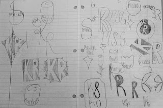
My Logo Design The Process           When I first heard about this project I was actually really excited for what the outcome would be. We started out the first couple of days just watching videos and really coming up with sketches. Even though this probably sounds easy and low-key, it was actually pretty challenging. We had to keep in mind things like simplicity and if it would work in different colors. Not to mention if the whole design would look good on anything like a t-shirt, or storefront. Personally I had a large amount of ideas that I thought could work but once you try to sketch them they usually do not turn out, so it took me some time to come up with a few designs that I really liked and thought could be a good option for me. In the end of the sketching portion of this project I had come up with 4 designs that I was really satisfied with, and it was time to move on to adobe illustrator.             ...

sketch up house

Image
The Project We were assigned with the project of creating a house on the program sketch up. Of course this was going to be a challenge considering that we had never used that program, but we got the hang of it. When making the house we were not just making it up in our minds, we were going off of a house that we chose on the website called houseplans.com. The requirements were that the house had to be a certain size, and that it could only be one level. But other than that, the project was really open to creativity. After finishing the house, we were also given the task to create a "movie" type production of our house. There was no specific time limit for this, and it could include as many slides as it took to really show off the best spots of our houses. Overall, I appreciated that this project allowed us to be open-minded and gave us the opportunity to see how some people actually design houses. What I Learned Throughout this project I have learned many aspects of ...

ball bouncing animation

Image
The Project In this project we had to make 3 different animations that included bouncing a ball. The first animation was the most simple. All we had to do was have a ball bouncing up and down and then turn it into a gif. In the second animation we had a ball bouncing again, but this time it bounced from the left side to the right side of the screen. This one was a little bit more confusing, but after a couple of minutes, it was easy to catch on to what you were doing. In the final animation, we were given the opportunity to be more creative and kind of come up with our own animation. We didn't not really have many requirements either, it just had to have something to do with what we were learning the past few days. After all of the animations were done, I felt pretty satisfied with how they turned out. What I Learned Throughout this project I learned many new things. We first had to start of with how to do a l...

10 words animation

Image
The Project We were assigned a project where we had to make a animation of 10 words that describe us. We had already picked out these 10 words last quarter, so the whole objective of this project was to basically get introduced to adobe photoshop. We had some requirements, like they all had to come from off the screen to on the screen, and we also had to have all 10 words on the screen in about 4 seconds. But we were also given a lot of chance to add in our own creativity. We could change the colors of the words, we could have different fonts and sizes, and we could also choose how we wanted our words to come on the screen, like if we wanted them to bounce of a wall or twirl around. It was really a lot of our own choices that made up how the project turned out. What I Learned  The main thing I learned while doing this project was a lot about photoshop. I learned how to create a video timeline and all of the different ways you can bring something on to the screen. I also lea...

Logo Color Schemes

Image
Logo Color Schemes Analogous This photo uses the analogous colors of dark brown, brown, and a lighter tan. I think the company chose these colors because it shows the colors of the drink and it gives the consumer a better idea of what the product is.            This photo uses the analogous colors of dark green, green, and yellow. I think the company chose these colors because greens and yellows are typically used to symbolize nature, and they wanted to portray that their company is nature friendly, or more of a natural gas station compared to others. Complementary This photo uses the complementary colors of orange and blue. I think the company chose these colors because, in a more obvious way, the foxes fur coats are orange, but i feel like they made the earth mainly blue to show that they are loyal, and that you can trust their browser  This photo uses the complementary colors of red and green. I ...

typography anatomy project

Image
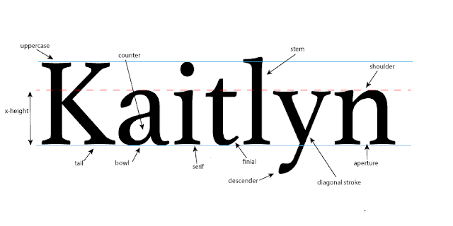
The Project In this project we were assigned with the task of taking our names, and pointing out all of the different typography that could possibly be in them. We looked at different fonts and watched videos to help us understand what we were supposed to do, and once we had an idea on what different typography our names had in them, we headed over to adobe illustrator and got started. The project itself was pretty self explanatory, but one of our requirements was to have at least 10 different pieces of "typography anatomy" in our name, which was kind of cool for me personally, just because I didn't know that there were so many parts that make up something so simple, like a name. What I Learned Throughout this whole mini unit, I learned a lot of new information. We talked about fonts and how there are serif and sans-serif fonts. Also how different fonts can portray how you want the message to be read and if it is a more serious tone, or a more fun tone. We discuss...

color wheel

Image
The Project We were given a project where we had to make a color wheel on adobe illustrator, but before we could make the color wheel we had to learn about the different colors and how there are different color combinations that work together. After we took notes we then had to start using adobe illustrator, which was pretty new for me so it took some time to figure out all of the shortcuts, shapes, and everything like that. After getting used to the program It was a pretty fun project, which was good. What I Learned Throughout the days that we were working on this project we learned a lot of information. We looked at the color wheel and how there are primary and secondary colors. We also looked at different color schemes like complementary which are colors across from each other, and triad colors which are three colors that make a triangle on the color wheel, not to mention schemes like analogous and split complementary. We were also tau...

kaitlyn rose sidewalk chalk

Image
When we first got into our group, it took everyone a little bit of time to figure out what symbols we would want to use. For me, I already knew that I could use a dance shoe since I am a dancer, but I wanted to use something a little bit different. By the end of class that first day I had a few options that I liked a lot, a horseshoe for good luck and a red rose for hope, balance, and promise were a couple of them.  I was thinking that good luck is always something that everyone wants, which is why I chose the horseshoe. For the rose I knew that different colors had different meanings and I came to the conclusion that the meaning of a red rose fit what I wanted the best, especially since it symbolized hope. On the second day of this project my group finally started to combine our ideas into one symbol. It took many, many sketches but we finally found one symbol that we liked. The outside part of our symbol that tied everything together was a basket, our idea was to put all...