Posts

Final Website Project

Image
The Project This was the last e-Comm project that we had to do in our animation section of the e9 class. It was considered our "final"and was actually pretty challenging to figure out. We were assigned with the task of creating a website that consisted of many things. We had to have a home page, a projects page, and there were many factors that went into building each one, like adding links, or photos. Not only did we have to make the website, but the program that we made it on was completely new to us, and something that we had never been introduced to. It was call DreamWeaver, and as usual, it took some time to fully get used to the project. I would have to say that this project was quite challenging, just because we had to make sure that everything was right, by following certain videos from Mr.Olson. But Overall, I am very proud of the outcome, and impressed that it looks like this.  What I Learned Throughout this week and working on this project, I have learned ...
My Logo

Image
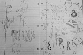
My Logo Design The Process           When I first heard about this project I was actually really excited for what the outcome would be. We started out the first couple of days just watching videos and really coming up with sketches. Even though this probably sounds easy and low-key, it was actually pretty challenging. We had to keep in mind things like simplicity and if it would work in different colors. Not to mention if the whole design would look good on anything like a t-shirt, or storefront. Personally I had a large amount of ideas that I thought could work but once you try to sketch them they usually do not turn out, so it took me some time to come up with a few designs that I really liked and thought could be a good option for me. In the end of the sketching portion of this project I had come up with 4 designs that I was really satisfied with, and it was time to move on to adobe illustrator.             ...

sketch up house

Image
The Project We were assigned with the project of creating a house on the program sketch up. Of course this was going to be a challenge considering that we had never used that program, but we got the hang of it. When making the house we were not just making it up in our minds, we were going off of a house that we chose on the website called houseplans.com. The requirements were that the house had to be a certain size, and that it could only be one level. But other than that, the project was really open to creativity. After finishing the house, we were also given the task to create a "movie" type production of our house. There was no specific time limit for this, and it could include as many slides as it took to really show off the best spots of our houses. Overall, I appreciated that this project allowed us to be open-minded and gave us the opportunity to see how some people actually design houses. What I Learned Throughout this project I have learned many aspects of ...

ball bouncing animation

Image
The Project In this project we had to make 3 different animations that included bouncing a ball. The first animation was the most simple. All we had to do was have a ball bouncing up and down and then turn it into a gif. In the second animation we had a ball bouncing again, but this time it bounced from the left side to the right side of the screen. This one was a little bit more confusing, but after a couple of minutes, it was easy to catch on to what you were doing. In the final animation, we were given the opportunity to be more creative and kind of come up with our own animation. We didn't not really have many requirements either, it just had to have something to do with what we were learning the past few days. After all of the animations were done, I felt pretty satisfied with how they turned out. What I Learned Throughout this project I learned many new things. We first had to start of with how to do a l...

10 words animation

Image
The Project We were assigned a project where we had to make a animation of 10 words that describe us. We had already picked out these 10 words last quarter, so the whole objective of this project was to basically get introduced to adobe photoshop. We had some requirements, like they all had to come from off the screen to on the screen, and we also had to have all 10 words on the screen in about 4 seconds. But we were also given a lot of chance to add in our own creativity. We could change the colors of the words, we could have different fonts and sizes, and we could also choose how we wanted our words to come on the screen, like if we wanted them to bounce of a wall or twirl around. It was really a lot of our own choices that made up how the project turned out. What I Learned  The main thing I learned while doing this project was a lot about photoshop. I learned how to create a video timeline and all of the different ways you can bring something on to the screen. I also lea...

Logo Color Schemes

Image
Logo Color Schemes Analogous This photo uses the analogous colors of dark brown, brown, and a lighter tan. I think the company chose these colors because it shows the colors of the drink and it gives the consumer a better idea of what the product is.            This photo uses the analogous colors of dark green, green, and yellow. I think the company chose these colors because greens and yellows are typically used to symbolize nature, and they wanted to portray that their company is nature friendly, or more of a natural gas station compared to others. Complementary This photo uses the complementary colors of orange and blue. I think the company chose these colors because, in a more obvious way, the foxes fur coats are orange, but i feel like they made the earth mainly blue to show that they are loyal, and that you can trust their browser  This photo uses the complementary colors of red and green. I ...

typography anatomy project

Image
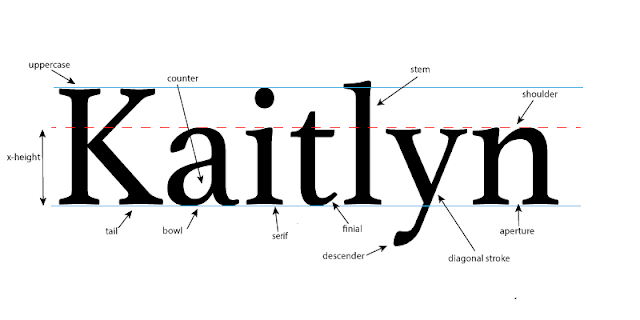
The Project In this project we were assigned with the task of taking our names, and pointing out all of the different typography that could possibly be in them. We looked at different fonts and watched videos to help us understand what we were supposed to do, and once we had an idea on what different typography our names had in them, we headed over to adobe illustrator and got started. The project itself was pretty self explanatory, but one of our requirements was to have at least 10 different pieces of "typography anatomy" in our name, which was kind of cool for me personally, just because I didn't know that there were so many parts that make up something so simple, like a name. What I Learned Throughout this whole mini unit, I learned a lot of new information. We talked about fonts and how there are serif and sans-serif fonts. Also how different fonts can portray how you want the message to be read and if it is a more serious tone, or a more fun tone. We discuss...