Posts

Showing posts from October, 2017

Logo Color Schemes

Image
Logo Color Schemes Analogous This photo uses the analogous colors of dark brown, brown, and a lighter tan. I think the company chose these colors because it shows the colors of the drink and it gives the consumer a better idea of what the product is.            This photo uses the analogous colors of dark green, green, and yellow. I think the company chose these colors because greens and yellows are typically used to symbolize nature, and they wanted to portray that their company is nature friendly, or more of a natural gas station compared to others. Complementary This photo uses the complementary colors of orange and blue. I think the company chose these colors because, in a more obvious way, the foxes fur coats are orange, but i feel like they made the earth mainly blue to show that they are loyal, and that you can trust their browser  This photo uses the complementary colors of red and green. I think the company chose these colo
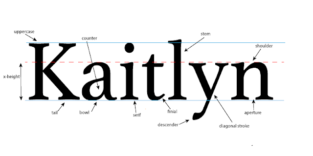
typography anatomy project

Image
The Project In this project we were assigned with the task of taking our names, and pointing out all of the different typography that could possibly be in them. We looked at different fonts and watched videos to help us understand what we were supposed to do, and once we had an idea on what different typography our names had in them, we headed over to adobe illustrator and got started. The project itself was pretty self explanatory, but one of our requirements was to have at least 10 different pieces of "typography anatomy" in our name, which was kind of cool for me personally, just because I didn't know that there were so many parts that make up something so simple, like a name. What I Learned Throughout this whole mini unit, I learned a lot of new information. We talked about fonts and how there are serif and sans-serif fonts. Also how different fonts can portray how you want the message to be read and if it is a more serious tone, or a more fun tone. We discuss