My Logo
My Logo Design
The Process
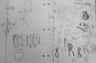
 When I first heard about this project I was actually really excited for what the outcome would be. We started out the first couple of days just watching videos and really coming up with sketches. Even though this probably sounds easy and low-key, it was actually pretty challenging. We had to keep in mind things like simplicity and if it would work in different colors. Not to mention if the whole design would look good on anything like a t-shirt, or storefront. Personally I had a large amount of ideas that I thought could work but once you try to sketch them they usually do not turn out, so it took me some time to come up with a few designs that I really liked and thought could be a good option for me. In the end of the sketching portion of this project I had come up with 4 designs that I was really satisfied with, and it was time to move on to adobe illustrator.
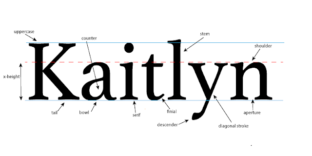
 Going to adobe illustrator I was feeling pretty confident that I knew what I was going to do, but it is really different once you actually start attempting to create the design. As you can tell, I narrowed my options down and picked the 2 that I thought would work the best. The first one was making a rose, and then putting my name inside of it. This was pretty challenging trying to figure out all of the shortcuts and how to actually make it look like a rose and I didn't know if I was really crazy about it. So I tried my other option which I felt was a lot simpler than the rose, I took my first and last initials and and basically just flipped the R around, once I started working on this one I definitely thought that it looked really good, but I had to figure things out like the fonts that I would use and how to make a clipping mask and things like that. After I had an idea on these 2 logos I was ready to add color and finally decided which one I was going to use.


Comments
Post a Comment